I'm a learning designer who builds systems, tools, and experiences that help people learn, reflect, and grow—academically and in real life.
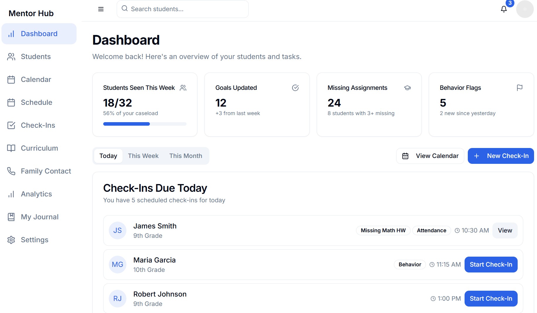
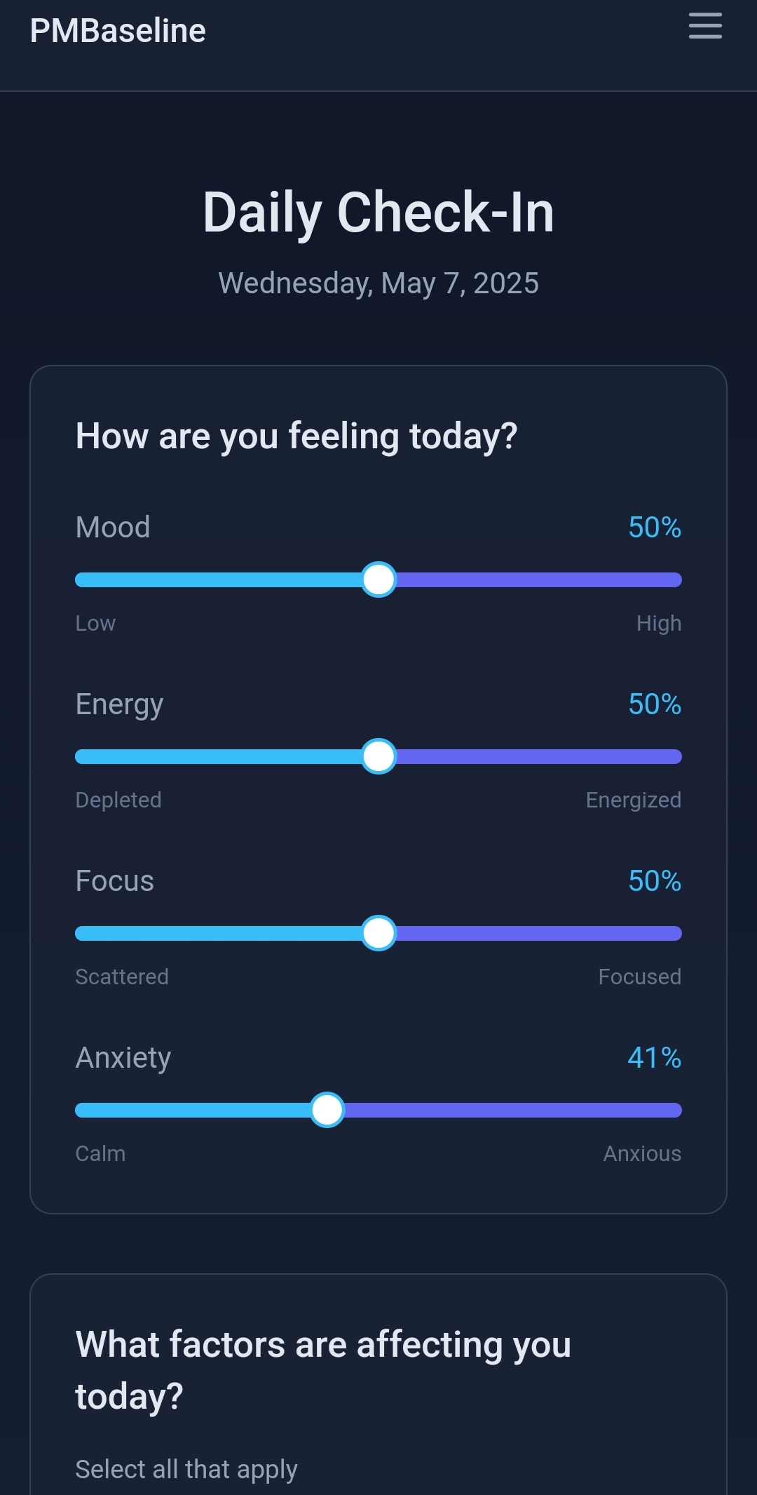
Currently pursuing a Master's in Learning Design & Technology at the University of San Diego, I design instructional systems and also build real-world learning tools. My work spans from eLearning modules and assessments to wellness apps and mentoring dashboards.
I'm interested in problems where learning design meets technology: reducing digital friction, designing for learner agency, and creating experiences that help people build independence and curiosity.